Visualization
Logic synthesis is inherently structural, and visualizing an AIG is one of the fastest ways to debug a network,
understand what an optimization pass actually changed, or explain a circuit to someone else. aigverse does not
ship its own plotting library, but it exposes the network structure through standard formats and adapters so that
mature Python visualization tooling can be used directly. The examples below use structured benchmark networks
(see Generators) rather than arbitrary toy circuits, so the resulting structures are non-trivial and
reproducible: the Graphviz, NetworkX, and highlighting examples share a single ripple-carry adder, while the
optimization comparison at the end uses a separate carry-lookahead adder.
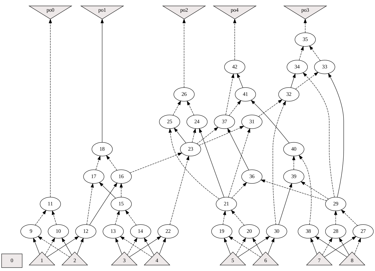
Graphviz (DOT) Export
The write_dot() function writes a network to a
Graphviz DOT file. Once written, the file can be rendered directly inside a script or
notebook using the graphviz Python package.
 1import graphviz
 2
 3from aigverse.generators import ripple_carry_adder
 4from aigverse.io import write_dot
 5
 6# A 4-bit ripple-carry adder, reused throughout this page
 7aig = ripple_carry_adder(bitwidth=4)
 8
 9# Write to DOT format
10write_dot(aig, "example.dot")
11
12# Render the DOT file inline
13graphviz.Source.from_file("example.dot")
Note
Rendering DOT files requires a local Graphviz installation (the dot executable) in addition to the graphviz
Python package.
NetworkX and Matplotlib
The to_networkx() adapter converts an AIG into a DiGraph,
which can be laid out and drawn with NetworkX and Matplotlib.
A full worked example that labels nodes with their level, fanout, type, and function is available in the
NetworkX section of the Machine Learning Integration guide. A minimal version of
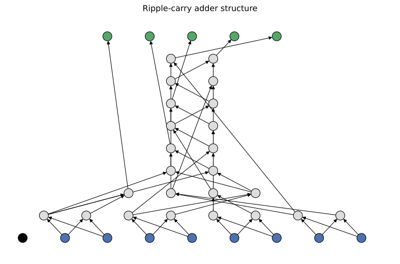
the same workflow, using networkx.multipartite_layout to place every node on the row that matches its logic
level (so all primary inputs line up on a single row) and coloring nodes by type:
 1import matplotlib.pyplot as plt
 2import networkx as nx
 3
 4import aigverse.adapters
 5
 6# Node type one-hot order is [constant, pi, gate, po]
 7type_colors = ["black", "#4C72B0", "#DDDDDD", "#55A868"]
 8
 9
10def draw_layered(graph, node_colors, node_sizes, *, title):
11    """Draws a NetworkX AIG graph with nodes arranged into rows by logic level."""
12    pos = nx.multipartite_layout(graph, subset_key="level", align="horizontal")
13    plt.figure(figsize=(8, 5))
14    nx.draw(
15        graph, pos, node_color=node_colors, node_size=node_sizes, edgecolors="black", linewidths=0.8,
16        arrows=True, arrowsize=10, width=0.8,
17    )
18    plt.title(title)
19    plt.show()
20
21
22# Convert the AIG to a NetworkX graph, including each node's logic level
23G = aig.to_networkx(levels=True)
24
25node_colors = [type_colors[data["type"].argmax()] for _, data in G.nodes(data=True)]
26draw_layered(G, node_colors, node_sizes=180, title="Ripple-carry adder structure")
Highlighting Critical Paths and Fanout
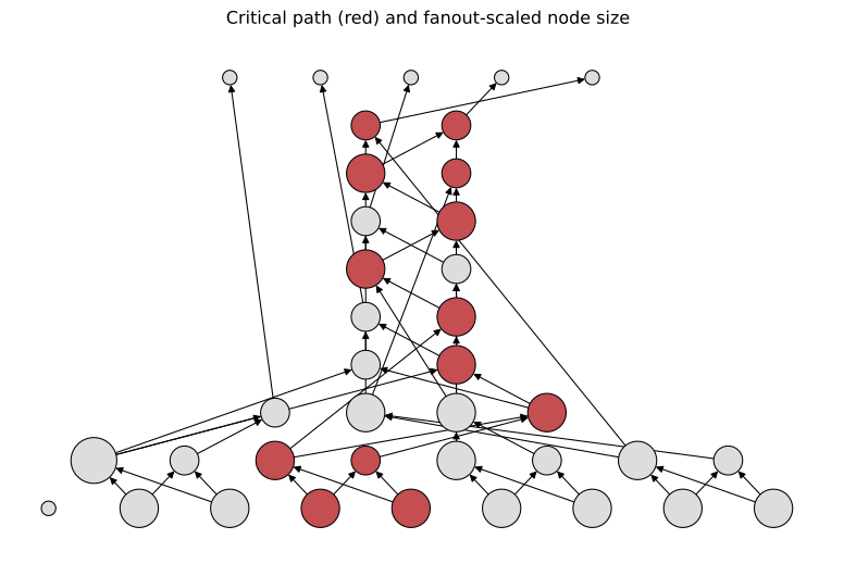
Wrapping an AIG in DepthAig or FanoutAig exposes
per-node critical-path and fanout information, which can be used to color-code a plot, making bottlenecks and
high-congestion nodes immediately visible.
 1from aigverse.networks import DepthAig, FanoutAig
 2
 3depth_aig = DepthAig(aig)
 4fanout_aig = FanoutAig(aig)
 5
 6# Synthetic PO nodes (index >= aig.size) represent outputs, not real AIG nodes, so they are excluded here.
 7node_colors = ["#C44E52" if node < aig.size and depth_aig.is_on_critical_path(node) else "#DDDDDD" for node in G.nodes()]
 8node_sizes = [100 + 300 * fanout_aig.fanout_size(node) if node < aig.size else 100 for node in G.nodes()]
 9
10draw_layered(G, node_colors, node_sizes, title="Critical path (red) and fanout-scaled node size")
Interactive Exploration
For larger AIGs, a static plot quickly becomes hard to read. Interactive graph-drawing libraries such as
pyvis or ipycytoscape can render the same
DiGraph produced by to_networkx() as a zoomable, draggable
graph with hover tooltips for node attributes. These are not dependencies of aigverse and must be installed
separately.
Before vs. After: Visualizing Optimization
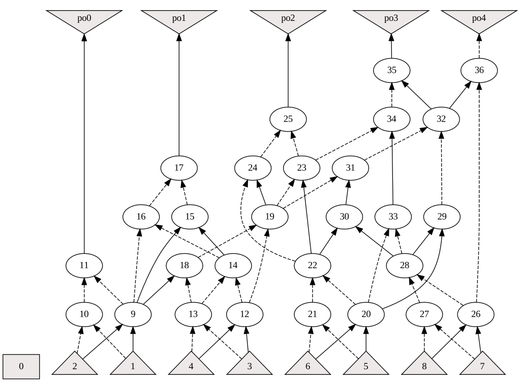
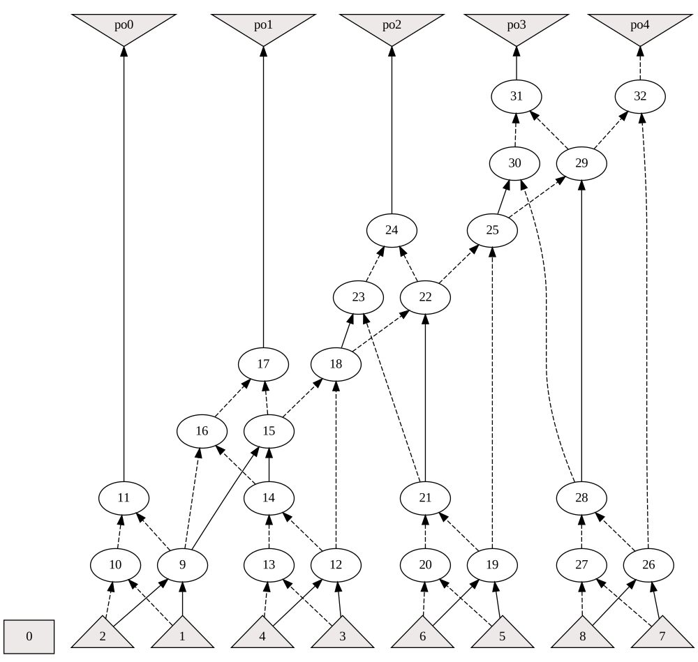
Comparing the DOT rendering of a network before and after an optimization pipeline visually confirms the effect of the transformation on structure, depth, and gate count. A 4-bit carry-lookahead adder makes for a good demonstration here, since (unlike the ripple-carry adder above) its structure still leaves room for the resubstitution, refactoring, and rewriting passes from the Algorithms guide to find and remove redundant logic.
 1from aigverse.algorithms import aig_cut_rewriting, aig_resubstitution, balancing, cleanup_dangling, sop_refactoring
 2from aigverse.generators import carry_lookahead_adder
 3from aigverse.networks import DepthAig
 4
 5# Generators can leave behind a handful of dead gates; clean those up first for a fair baseline
 6aig_cla = cleanup_dangling(carry_lookahead_adder(bitwidth=4))
 7
 8aig_optimized = aig_cla.clone()
 9aig_optimized = aig_resubstitution(aig_optimized)
10aig_optimized = sop_refactoring(aig_optimized)
11aig_optimized = aig_cut_rewriting(aig_optimized)
12aig_optimized = balancing(aig_optimized, rebalance_function="sop")
13
14write_dot(aig_cla, "before.dot")
15write_dot(aig_optimized, "after.dot")
16
17print(f"Before: {aig_cla.num_gates} gates, {DepthAig(aig_cla).num_levels} levels")
18print(f"After:  {aig_optimized.num_gates} gates, {DepthAig(aig_optimized).num_levels} levels")
Before: 34 gates, 8 levels
After:  28 gates, 6 levels
1graphviz.Source.from_file("before.dot")
1graphviz.Source.from_file("after.dot")